plot 툴 중 하나인 matplotlib.pyplot 을 사용 합니다.
plot figures 에 이어서, figure 안에 여러가지를 넣어 꾸미기를 해봅니다.
-
평행선 horizontal line 먼저 그래프에 평행선을 넣으려면 hline example 에서처럼 matplotlib.pylab을 import 한 뒤에 axhline 함수를 이용하면 됩니다.
-
텍스트 text 텍스트를 넣으려면 matplotlib.pyplot 을 import 한 뒤, text 함수를 이용합니다.
-
화살표 arrow 화살표를 넣고 싶으면 matplotlib.pyplot 을 import 한 뒤, annotate 함수를 이용합니다.
-
그래프 설정 figure settings 예제와 같이 축, 라벨, 폰트 등등에 대한 크기 등을 설정할 수 있습니다.
import numpy as np
import matplotlib.pyplot as plt
import matplotlib.pylab as pylab

#####################################################################
# plot the figure
#####################################################################
# set figure
Fig = plt.figure()

SMALL_SIZE = 8
MEDIUM_SIZE = 10
BIGGER_SIZE = 16

plt.rc('font', size=BIGGER_SIZE) # controls default text sizes
plt.rc('axes', titlesize=BIGGER_SIZE) # fontsize of the axes title
plt.rc('axes', labelsize=MEDIUM_SIZE) # fontsize of the x and y labels
plt.rc('xtick', labelsize=MEDIUM_SIZE) # fontsize of the tick labels
plt.rc('ytick', labelsize=MEDIUM_SIZE) # fontsize of the tick labels
plt.rc('legend', fontsize=BIGGER_SIZE) # legend fontsize
plt.rc('figure', titlesize=BIGGER_SIZE) # fontsize of the figure title
plt.rcParams['axes.labelsize'] = MEDIUM_SIZE
plt.rcParams['axes.labelweight'] = 'bold'

####################################################################
# plot shadow & text
#####################################################################
plt.axvspan(4.892, 4.892+0.56, facecolor='gray', alpha=0.1)
plt.text(4.95, 1100, r'\textbf{swing}', fontsize=12)
plt.axvspan(4.892+0.56, 4.892+0.7, facecolor='blue', alpha=0.1)
plt.text(5.4, 1200, r'\textbf{DP}', fontsize=12)


#####################################################################
# plot data
#####################################################################
plt.plot(time[start_time:end_time], data[start_time:end_time,0:3], '--', linewidth=_linewidth)
plt.plot(time[start_time:end_time], data[start_time:end_time,3:6], '-', linewidth=_linewidth)

#####################################################################
# plot the horizontal line
#####################################################################
pylab.axhline(y=559.17, color='g', linestyle=':', linewidth=1)


# set labels (LaTeX can be used)
if title_flag == 1:
    plt.title(r'\textbf{force}', fontsize=fontsize)

plt.xlabel(r'\textbf{time (s)}', fontsize=fontsize)
plt.ylabel(r'\textbf{linear force (N)}', fontsize=fontsize)
plt.legend(['$x_d$', '$y_d$', '$z_d$','x', 'y', 'z'], frameon=False)
plt.show()

Fig.savefig("./figures/eps/data.eps", bbox_inches='tight')
Fig.savefig("./figures/png/data.png", bbox_inches='tight')
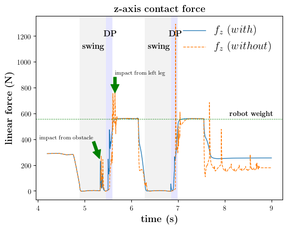
위의 코드를 이용하여 그래프를 그리면 다음과 같은 결과를 얻을 수 있습니다.